The previous chapter presents
introductory material.
Viewer Software
The viewer software provides the user interface for
accessing information in the electronic publishing
system. Since electronic publishing provides the user
with access to a vast amounts of published information,
the most appropriate metaphor appears to be that of
a library. While at first thought the library metaphor
might seem to be quite simple, anyone who has recently
walked into a reasonable sized library knows what a
daunting experience libraries can be, particularly
for someone who is an infrequent library visitor.
This section focuses in on the issues of providing
a reasonable user interface to electronic publishing.
The Library Metaphor
The central task of using a library is the one of
letting the user relatively easily navigate themselves
to the information they are interested in. In current
libraries, the basic information navigation tool is
the "card" catalog which indexes the library's books
based on author, subject, and title. Since many
libraries have already discovered that it is economical
to replace their paper based card catalogs with
electronic ones, it is somewhat humorous to note that
card catalogs no longer seem to have any cards. To
eliminate this possible confusion, this paper refers
to the card catalog as the author/subject/title indices.
As a general rule, each library book typically has
one entry in each of the author, subject, and title
indices; exceptions to the general rule abound (e.g.
multi-author books, multi-subject books, books with
no easily identifiable author, etc.) While
author/subject/title indices have limitations, all
viewer software presenting a library metaphor for
electronic publishing will provide access to these
basic indices.
In addition to the standard author/subject/title
indices, many libraries also purchase or maintain
other indices. Examples of other indices are:
-
Periodical Index
-
A list of all periodicals maintained by
the library.
-
Books in print
-
A list of books that are still available
from publishers.
-
Forthcoming books
-
A list of books scheduled to be printed in
the near future by publishers.
The viewer software must provide reasonable means
for finding and using these additional indices.
Of course, whenever the user is having difficulty
locating some information, a librarian can be
consulted. A librarian is frequently able to help
a user locate the information they are interested
in (then again, sometimes a librarian does not have
a clue.) Since the viewer software is presenting
electronic publishing as a vast electronic library,
it seems natural that users will occasionally need
to consult with real, live, flesh-and-blood
librarians. The consultation can be done either
via electronic mail or by simply picking up the
phone and calling a librarian directly. Since
librarians must earn a living, there must be a way
for compensating librarians for their services.
The librarian compensation issue is discussed further
below.
Accessing electronically published information is
not free. In general, there is a tension between
the authors who wish to maximize the amount of
royalties collected and the users who are equally
interested in reducing the amount of royalties they
pay out. Free market economics will dictate what
royalties authors and users find mutually acceptable.
The viewer software needs to provide the user with
the ability to set a royalty pay out level below
which they will not be bothered; whenever an author
asks for royalties that exceed this pay out level,
the user is queried to see whether they are willing
to pay the higher royalty rate.
The User Interface
Before discussing the viewer software issues in
greater detail, it is worthwhile to go through some
example viewer software screens. By the time
electronic publishing is deployed, computers with
window systems will be the norm (e.g. Microsoft
Windows, Macintosh System 7, Unix Motif, etc.)
Generally, window systems provide the user with
multiple overlapping windows that can be independently
resized and rearranged. In addition, the user has
the ability to point at a screen location with a
pointing device (i.e. a mouse) and click some sort
of button (i.e. a mouse button) to cause an action
to occur. The screens shown below do not adhere to
any particular graphical look-and-feel, since
look-and-feel standards vary depending upon window
system being used. Hence, the box surrounding a
line with two arrowheads corresponds to a stylized
scroll bar that is meant to be adapted to the window
system's standard look-and-feel as appropriate. In
the screen examples shown below, clicking on a small
shadow box causes the viewer software to perform some
action; usually, the desired action is pretty obvious
from the box location.
The design of good graphical user interfaces is
extremely difficult and should be designed in
conjunction with at least one human factors
specialist. Since the screens shown below were
not done in conjunction with a human factors
specialist, they should merely be viewed as a
broad outline of what viewer software should look
like. In particular, the decision to always reuse
the same window for displaying information is
really quite arbitrary and should be revisited
as a design decision.
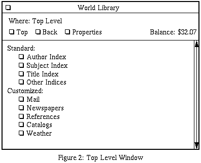
After the user has installed the viewer software,
they will be presented with window that looks somewhat
like the one shown below. The top window
panes stay pretty much the same as the user navigates
through the electronic library. The lower half of the
window contains the current view into the library. It
starts out at the "top level" which is basically the
standard author/subject/title indices and a customized
menu list. The example shown below has a fairly
simple customized top level menu consisting of Mail,
Newspapers, Magazines, References, Catalogs, and Weather.
Clicking on the box labeled "Top" always brings the user
back to this top level window; similarly, clicking on
"Back" takes the user back to the previous view. Clicking
on "Properties" brings up a property sheet that permits
the user to customize the viewer software; in particular,
it is from the property sheet that the user can create and
rearrange the customized menus accessible from the top
level window. The properties window is discussed further
below.

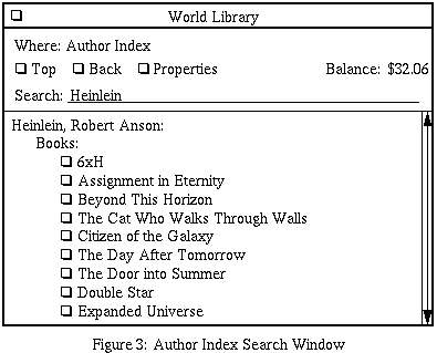
When the user clicks on the box labeled "Author Index"
in the top level window, an search window that looks
somewhat like the one shown in the search window below
is presented; in this example, the user has searched for
an author named "Heinlein" and found the fairly well known
science fiction author named Robert A. Heinlein. The subject
and title index windows look very similar to the author
index window. The user can click on one of the book
glyphs to immediately jump to the selected book.

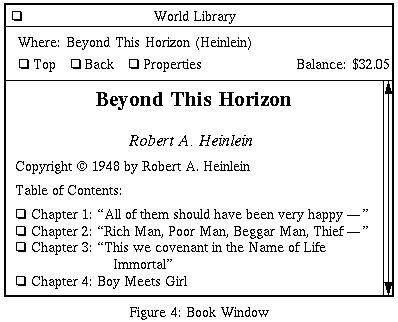
For the example shown above, if the user clicks
the book glyph for "Beyond This Horizon", a book view
similar to the one below is shown. A book typically
starts out with the title, author and copyright
information followed by a table of contents. By clicking
on one of the chapter glyphs in the table of contents,
the user is immediately taken to the specified chapter
and reading can commence; alternatively, the user can
just use the scroll bar to scroll past the end of the
table of contents to find chapter 1.

The first thing to notice about the example user
interface is that it models a library very closely.
A user can walk into just about any library in the
world, find the card catalog (or its equivalent) and
start searching for information. The library metaphor
is followed closely, except that rather than getting
an index number and searching for the book in the
stacks, the user can start reading the information
immediately.
Hypertext Links
One of the exciting facilities that electronic
publishing can provide over and above what is
available with paper publishing is the ability
to interconnect material via hypertext links.
The term "hypertext link" was originally coined
by Theodore (Ted) Nelson and corresponds to a
facility whereby a user can quickly jump from
one piece of material to another piece of (usually)
related material.
For electronic publishing it is useful to distinguish
between two kinds of hypertext links - embedded and
overlaid. An embedded hypertext link is one that is
published with a document and is always displayed.
An overlaid hypertext link is one that is published
separately from the original document; the viewer
software will provide the user with the ability to
control which overlay hypertext links are to be
displayed in conjunction with a document.
Embedded hypertext links can be further categorized
into intra-document and inter-document hypertext links.
Intra-document hypertext links are ones that jump
around within a document; some examples of
intra-document hypertext links are:
-
to connect a table of contents to the
corresponding chapters
-
to interconnect a document index back to
the corresponding document sections.
-
to provide for footnotes.
-
to provide for internal cross references
within a document.
-
to connect a piece of text to an embedded
figure or table.
Inter-document hypertext links are ones used to
reference other separately published documents that
quite possibly reside in other repositories; examples
of inter-document hypertext links are:
-
the ability directly access information
that is found in a bibliography.
-
the ability to connect an author/subject/title
index entry to a document.
-
the ability to quote material directly out of
another document by reference without having
to copy the quote. This kind of quote is quite
appealing in that both saves space and permits
royalties to be shared amongst multiple authors.
To the user, embedded hypertext links would manifest
themselves as some sort of glyph which if clicked
upon, would cause the hypertext link to be traversed.
After the user has examined as much of the information
at the other end of the hypertext link, clicking on the
box labeled "Back" will return the user to where they
came from.
Overlay hypertext links are published separately from the
documents that they are attached to. The authors of overlay
hypertext links collect royalties whenever the user decides
to traverse one of them. Thus, in electronic publishing
there is money to be made in both publishing original
documents and publishing overlay hypertext links that
interconnect the documents.
The naive view of overlay hypertext links is that they
are global and all of them will always be displayed.
Alas, the quality of overlay hypertext links will vary
greatly and users will quickly tire of experimenting to
find out which ones are interesting or not, particularly
if the user is paying for the privilege of traversing the
links. A more realistic model of overlay hypertext links
is that there will be a number of organizations that
publish groupings of overlay hypertext links and users
will pick a number of these overlay groupings to display.
Organizations that maintain high quality standards for
their overlay hypertext link groupings will be actively
subscribed to; conversely, organizations with lower
quality standards will be less actively utilized.
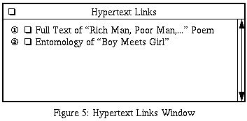
The most common form of overlay hypertext link will be
a unidirectional point-to-point link. As the user is
reading a document, occasionally they will come across
a glyph that marks one end of a unidirectional
point-to-point link. In the examples below, an
end-point will be represented as a circle with a number
in it. When the user clicks on an end-point
glyph, a hypertext link summary window similar to the
one below is popped-up and it is scrolled
to show the appropriate end-point glyph. By convention,
unidirectional point-to-point hypertext links are
structured so that the bulk of the cost of traversing
the link does not occur until the user clicks on the
appropriate box in the overlay hypertext links window.
Bidirectional point-to-point links are constructed
using two unidirectional point-to-point links.

The Property Sheet
The user controls the viewer software behavior through
the property sheet window. The user brings up the property
sheet by clicking on the box labeled "Properties". The
property sheet is used to:
-
create/delete/maintain accounts and set royalty
thresholds
-
customize top-level menus
-
control the rendering of text
-
select overlay hypertext groupings
-
select filtering options
-
mask/highlight spans of text
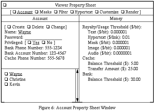
Account Property Sheet
Before a user can use the viewer software at all, at
least one account must be set up. Since multiple people
might use same machine and viewer software, the viewer
software must implement the concept of an account (e.g.
members of the same family.) An account registration
portion of the property sheet might look somewhat as
shown below:

An account contains:
-
an account name, password, and privilege.
Each account is named, typically with the
first name of the person who will use it.
Since usage of electronic publishing results
in usage/royalty payments, it is prudent to
protect account usage with a password. A
privileged account is one that can create,
delete, and change other accounts. Accounts
set up for children will almost certainly
have restrictions placed upon them.
-
an electronic bank phone number and account
number. Each account may choose to utilize
a different electronic bank. An electronic
bank is identified by the phone number to
call to interact with it.
-
a cache phone number. Each account may choose
to utilize a different cache service. Like
electronic banks, a cache is identified by
the phone number to call to interact with it.
-
royalty/usage thresholds. While "a picture
is worth a thousand words" it may take
substantially more storage than 1000 words.
Thus, users will choose to pay differing rates
for text, images, audio, and hypertext links.
The user can set a payment threshold for each
of these information types. Whenever the user
attempts to access information that exceeds
one of these thresholds, a pop-up window will
appear that queries the user whether or not the
higher rate is acceptable.
-
account thresholds and transfer amounts. The
user specifies a cache account threshold below
which additional money is transferred from the
user's electronic bank account to the cache
account; the amount transferred is also user
specified. Whenever the electronic bank account
balance drops below the electronic bank account
balance threshold, the user is informed via a
pop-up that the electronic bank account needs
to be replenished.
The Masks Property Sheet
The masks portion of the property sheet allows the user
to control information masking. Information masks allow
adults to restrict and/or emphasize information. The
primary purpose of the masking facility is to provide
a mechanism for parents to impose some quality standards
and/or restrictions on the electronically published
material that their children access. A masking facility
is required since electronic publishing will not be able
to enforce any standards on any of the electronically
published material. While restricting information from
adults is a dubious practice, restricting information
from children is quite common. If the viewer software
lacks a masking facility, many parents will choose to
entirely disallow their children from independently
accessing any electronically published material; this
would certainly be unfortunate.
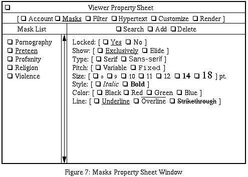
The "Masks Property Sheet Window" shown below
is obtained by clicking on the box labeled "Masks" in the
property sheet window. The first step towards selecting
a mask is to find it. By clicking on the box labeled
"Search" a search window very similar to the author
search window is shown in the main window;
this window is called the "Mask Search Window". The
user can search and scroll through the mask search
window for whatever masks seem appropriately interesting.
Organizations will choose to publish mask sets either for
profit or for because they feel strongly about their
particular mask criteria; those organizations in the
latter category will probably price their mask as close
to free as they can. Whenever an appropriate mask is found,
the user first clicks on the box labeled "Add" and then
clicks on the box next to the desired mask to cause the
named mask to show up in "Mask List". Masks can be deleted
from "Mask List" by first selecting the mask to be deleted
and then clicking on the box labeled "Delete". (The placement
of the "Search", "Add", and "Delete" controls seems
sub-optimal, to say the least.)

A mask's display characteristics are shown by selecting
the desired mask in "Mask List". They can be modified
by simply going through the display characteristics and
changing them. A mask that is locked can only be changed
by a privileged account. Parents that are setting up
accounts for children will almost certainly choose to
lock some of the masks. A mask for which "Exclusively"
has been selected, will suppress all material that does
not meet the specified mask. In general, it is best to
only have one mask at a time set to "Exclusively".
Conversely, a mask for which "Elide" has been selected
will replace all material that meets the criteria with
an ellipses (i.e. "...") The other font characteristics
can be set to provide additional highlighting.
The implementation of masks is very similar to hypertext
links and is deferred until repositories are discussed.
The Filter Property Sheet
If the world library is to live up to its name, it will
contain vast amounts of material is either out-of-date
and/or written in an unfamiliar language. If all of the
out-of-date and/or unfamiliar language material index
entries are presented intermixed with up-to-date and
familiar language material in a single index, the task
of culling out the uninteresting entries is foisted upon
the user, thereby making the index very difficult to use.
The problem of culling out uninteresting index entries
is called the index clutter problem and if it is not
solved, indices will be extremely difficult to use.
The solution to the index clutter problem is to provide
filtering facilities that allow the user to suppress
the display of index entries that are unlikely to be
of interest. While filtering can be based on the more
generic masking facility, for both performance and cost
reasons, it is more appropriate to special case the
filtering based on publication date and language.
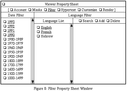
When the user clicks on the box labeled "Filter" a filter
property sheet similar to the one below is
shown. The user can activate the dates that they are
interested in clicking on the box next to the date ranges
they are interested. The selection of a set of languages
is very similar to mask selection. Clicking on the box
labeled "Search" causes the main window to display a
language search window very similar to the author search
window. When the user wishes to add a
language to "Language List", the box labeled "Add" is
clicked followed by clicking the language box in the
language search window. A language is removed from the
"Language List" by clicking on the box labeled "Delete"
followed by clicking on the appropriate language box in
the "Language List". Individual language are toggled on
and off by clicking on the appropriate language box
in the "Language List".

The implementation of filters is deferred until
repositories are discussed.
The Hypertext Property Sheet
As discussed in the section on hypertext links, users
will need the ability to select among a number of
hypertext link publishers. The facility to search
hypertext links is very similar to the mask searching
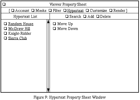
facility. When the user
clicks on the box labeled "Hypertext" a property sheet
similar to the one shown below appears.
The user can bring a hypertext link publisher search
window similar to the author search window shown
clicking on the box labeled "Search".
After having that looks interesting, the user clicks
on "Add" to add it to the "Hypertext" subwindow.
Hypertext publishers are deleted using the "Delete"
command. Particular hypertext link publishers are
enabled/disabled by going to the "Hypertext List"
and clicking on the box next to the publisher to
toggle its state. The order of hypertext link
publishers in the "Hypertext List" specifies the
order in which hypertext links are searched for.
Thus, when the user displays some text, they will
see the text first, followed shortly thereafter by
whatever hypertext links are associated with the text;
thus, hypertext links from the top of the "Hypertext
List" will show up more quickly than ones from the
bottom of the list. The boxes labeled "Move Up" and
"Move Down" are used to rearrange the order of entries
in the "Hypertext List".

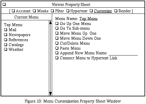
The Menu Property Sheet
Users will need the ability to quickly get to
information that they commonly access. A customizable
menu facility is one facility that will enable users
to quickly get to commonly accessed information. By
clicking on the box labeled "Customize", a menu
customization property sheet similar to the one
below is shown. Menus are hierarchical. The
boxes labeled "Go Up One Menu" and "Go To Sub-menu"
are used to go up and down the menu hierarchy. The
boxes labeled "Move Menu Up One" and "Move Menu Down One"
are used to rearrange the order menu entries. The
boxes labeled "Cut/Delete Menu" and "Paste Menu" are
used to move menu entries from one menu to another;
this is accomplished by cutting a menu entry (using
"Cut/Delete"), moving to another menu (using
"Go Up/Down"), and pasting the menu entry (using
"Paste") to the desired menu. New menu entries are
appended to the current menu using the box labeled
"Append New Menu Name". A menu is connected to an
existing hypertext link via the box labeled
"Connect Menu to Hypertext Link".

For example, to create the menu for "Newspapers",
the user performs the following steps:
-
The "Newspapers" sub-menus is created by:
-
clicking on "Go to Sub-menu",
-
a pop-up appears asking the user to select
the sub-menu from the current menu,
-
the user clicks on "Newspapers",
-
another pop-up appears asking the user
to confirm whether a new sub-menu is to
be created, and
-
the user clicks on the box labeled "Yes".
-
The user adds the "Wall Street Journal" and
"New York Times" to the menus by:
-
typing "Wall Street Journal" into the
enter area in "Append New Menu Name",
-
clicking on the box labeled "Append New
Menu Name", and
-
entering "New York Times" the same way.
-
The user connects up the "Wall Street Journal"
hypertext link as follows:
-
in the main window,
the user clicks on "Top" to get the top
level menu,
-
the user clicks on "Titles" to bring up
the title index search window that looks
like author search window,
-
the user types "Wall Street Journal" into
the search name text entry area and clicks
on the box labeled "Search",
-
the index entry labeled "Wall Street Journal"
appears,
-
in the menu Customization property sheet
window, the user clicks on the box labeled
"Connect menu to Hypertext Link",
-
a pop-up appears asking the user to select
a menu entry from the current list,
-
the user clicks on the box labeled "Wall
Street Journal" in the property sheet,
-
another pop-up appears asking the user to
click on the hypertext link in main window
to be connected to,
-
the user clicks on "Wall Street Journal" in
the main window, and
-
the connection to the "New York Times" is
done the same way.
It goes without out saying that a human factors
specialist will be able to improve upon this user
interface.
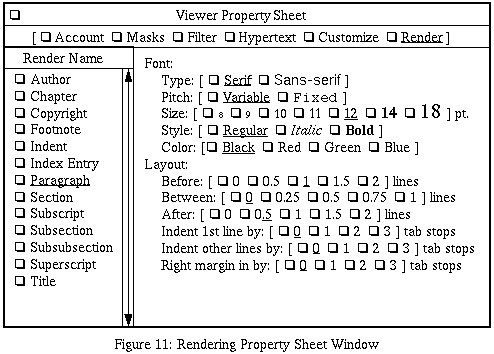
The Render Property Sheet
The user can control how text is to be displayed by
clicking on the box labeled "Render" to cause a window
similar to the one below to be shown. With the
"Render" property sheet, the user can select among the
various categories of text (i.e. author, title,
paragraph, footnote, etc.) and control the indentation,
line spacing, and font characteristics (size, style,
color, etc.)

Viewer Software Installation
It is important that the viewer software be easy to
install. Before the user can start browsing
electronically published material, they will have
to do the following:
-
Get the viewer software off of the
distribution media (e.g. floppy disk,
CD-ROM, etc.) and install it on the local
hard disk.
-
As described in 5.0, the user needs to find
an electronic bank. At installation time,
the viewer software can provide a reasonably
up-to-date list of electronic banks. The user
can set up an electronic bank account by either
visiting the electronic bank's office in person,
or by postal mail. When the user visits the
electronic bank in person, they bring cash or
a money order to deposit and leave with an
electronic checkbook floppy disk. If postal
mail is used, the user print out an application
form using their own printer, fill in the
information, write a check against their own
checking account, mail both to the electronic
bank, and the electronic bank will mail an
electronic checkbook floppy disk back to the
user.
Some electronic banks will probably provide a
stream-lined service whereby the user can call
up, provide a credit card number, the electronic
bank will ship a temporary electronic checkbook
over the phone lines to the user's computer to
be written onto a floppy disk supplied by the
user. The electronic checkbook supplied by the
electronic bank will arrive via the postal mail
a few days later.
-
Once the user has an electronic bank account,
a viewer software account can be set up by
filling in the information shown in the account
property sheet. The viewer
software can provide a list of reasonably
up-to-date cache phone numbers to select from.
-
The remaining property sheets can be
preinitialized to contain reasonable values so
that the user can get immediately start browsing
electronically published information.
-
The user can be walked through the whole
installation process using electronically
published installation material; enough of
this installation material would be shipped
with the viewer software to get the user get
"on-line."
Authoring Software
Whenever the user wants to author information for
publication, they need to use authoring software.
While the viewer software could provide its own
authoring software, it probably makes more sense to
let the user author their own material using the
word processor of their choice and instead have the
viewer software provide a capability for translating
the information into the appropriate format for
electronic publication.
For example, material can be written using Frame
Maker, written out in Maker Interchange Format
(i.e MIF) and some software can read the MIF file
and produce the appropriate electronic format.
References to other material can ...
Electronic Mail and Bulletin Boards
An electronic publication system should provide a
means for users to communication between themselves
using the system. Two common forms of electronic
correspondence are bulletin boards and direct
person-to-person mail.
Bulletin boards are the easiest to provide. Each
user that wants to contribute material will publish
it using their repository. A central location will
contain a list of hypertext links to each piece of
material posted to the electronic bulletin board.
There is a certain elegance to having the cost of
the bulletin board distributed amongst the bulletin
board's contributors; of course, a heavily read
bulletin board will actually generate revenue for
its contributors. The only cost that must be
maintained by the bulletin board itself is the cost
of a queue of hypertext links.
Electronic direct person-to-person mail is a bit
more difficult to provide since correspondence
is generally private. Public key cryptography is
a perfect match for this problem. A private message
can be sent to someone by encrypting it with a
public key and the publishing it via the same
mechanism as electronic buxletin boards. Again,
the user will need to bear the cost of a queue
of hypertext links to information sent to them.
The cost of the queue can be reduced by charging
a royalty for inserting a hypertext link into it;
this strategy should reduce the amount of
"junk e-mail" that advertisers will attempt
to send.
Viewer Software Summary
Hopefully, this whirl-wind tour of the viewer
software has convinced you that the viewers
software is feasible but will require a
significant amount of work to produce.
You may go to the next chapter discussing
repositories or back to the
table of contents.
Copyright 1992-1995
Wayne C. Gramlich All rights reserved.
